Improving accessibility for workout app

Accessibility

UI Design

Mobile App

Health-tech

Improving accessibility for workout app

Accessibility

UI Design

Mobile App

Health-tech

Improving accessibility for workout app

Accessibility

UI Design

Mobile App

Health-tech

Context

A few years ago, I was recommended to the CEO of a physiotherapist business. He wanted to build a mobile app to help middle-aged and mature adults (45+) improve their well-being with customisable home workouts.

The CEO had ambitious plans for the app and was keen to get started with development, but after some candid chats with older family members, he became concerned that he may have overlooked the needs and ‘technical abilities’ of the older end of his target audience (65+). 


Although there was a clear idea of aesthetics for the app and some basic wireframes, the CEO needed help bringing his ambitions to life, to ensure the result was relevant and valuable to his audience.

Challenges

  • Developers had been hired to start work based on the basic wireframe designs but needed more detail.


  • Whilst some informal and anecdotal target audience research had been done to test the product proposition, the requirements for the app were still in flux, and whilst there were many great feature ideas, a lack of prioritisation has contributed to a sense of ‘overwhelm’ for the CEO and hired developers.


  • There was no budget for user research or design testing before development work was due to start.

Results

Collaborating with the CEO to define the app’s MVP requirements, I;

  • Delivered accessible and attractive hi-fi designs ready for development

  • Educated stakeholders on accessibility best practices

Defining success.

Problems


Given this was a completely new product, there were no existing metrics to compare the success of the proposed designs against – so completing the hi-fi designs in the required timeframes (3 months) was the first obvious aim for the project.


Accessibility was a core requirement if the app itself was to be a success when launched, given the reoccurring concerns about ‘ease to use’ and ‘technical abilities’ of some of the target audience, this presented a great opportunity to ‘bake in’ accessibility best practices from the start.

Defining Success

Problems to solve


Given this was a completely new product, there were no existing metrics to compare the success of the proposed designs against – so completing the hi-fi designs in the required timeframes (3 months) was the first obvious aim for the project.


Accessibility was a core requirement if the app itself was to be a success when launched, given the reoccurring concerns about ‘ease to use’ and ‘technical abilities’ of some of the target audience, this presented a great opportunity to ‘bake in’ accessibility best practices from the start.

01.

Produce hi-fi designs of MVP features and core user journeys

Help identify app functionality requirements and develop designs in line with dark aesthetic preferences, within the agreed timeframe.

02.

Create an accessible & representative experience

Users (45+) should feel comfortable and confident navigating the app and setting up workouts.

Create an accessible & representative experience

Users (45+) should feel comfortable and confident navigating the app and setting up workouts.

Priorities and mapping.

MVP Requirements & Ideation

We delved into a comprehensive review of the many app ideas to prioritise the app’s must-have features, advocating a ‘less is more’ approach, the following features were identified as ‘must haves’ for the minimal viable product (MVP);

  • App onboarding

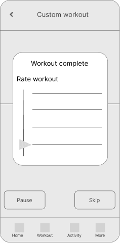
  • Customisable workouts (with the ability to customise workout by body area target, fitness goal or time, ability to add/remove exercises, record notes about an exercise etc)

  • ‘Ready-to-go’ workouts (with video exercise demonstrations)

  • Fitness tests (with video exercise demonstrations)

  • Fitness and Activity dashboard (later deprioritised for future iterations)

With a clearer definition of requirements, I developed a few of the given wireframes to illustrate how the app’s navigation structure could support the priority functionality, and how users may journey through the app.

Accessibility with personality.

Design

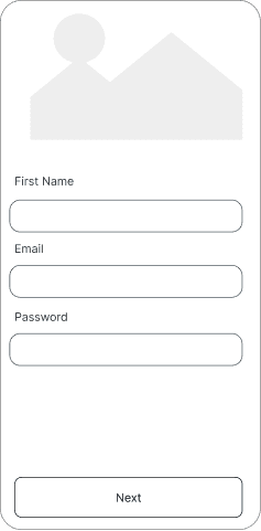
With the consensus that the wireframes were heading in the right direction, I began developing the app’s visuals, starting with the onboarding screens. I collaborated with the CEO to streamline his initial, extensive requirements—intended to support future personalisation and marketing purposes—into three short, digestible screens for a simplified experience:

  1. Sign-Up Details: Essential user information.


  1. Health Information: Basic health data for personalised workout recommendations.


  1. Goal Setting: User-defined fitness goals.

These initial screens set the stage for consistent accessibility principles throughout the app, including:

  • Clear Readability: The Open Sans typeface, introduced on these screens, is widely regarded as an accessible font. I used appropriate weights and sizes to ensure content readability across the app, and included static field labels (despite floating field labels being the preference at the time) to enhance ‘scanability’ on the pages.

  • Visual Contrast: I ensured the white font colour met WCAG AAA standards against the dark background and WCAG AA standards against the blue call-to-action buttons.

  • Touch Targets and Spacing: I designed all input fields and interactive elements large enough for easy tapping, with sufficient spacing to prevent accidental taps. I ensured input fields had clearly defined borders for quick identifiability.

  • Field Validation: To facilitate easy data input, I recommended clear and user-friendly field validation where required. For password fields, entry criteria were explained upfront on the screen.

Next, I turned my attention to the homepage design, highlighting the app’s primary features such as Workouts and Fitness Assessments.


Using a combination of card design and a simple navigation structure, I incorporated a mix of imagery and icons to make the home screen visually appealing and easily recognisable. For images on this screen and throughout the app, I aimed to use visuals representative of the diverse ages of the target audience. If budget wasn’t a constraint, I would have also included imagery representing a wider range of physical abilities.

Focusing on the workout flows, which included the CEO’s recorded video demonstrations, I included short written exercise instructions to ensure immediate usability and challenged the auto-play preference. While some of my accessibility recommendations, such as video captions, were delayed for later development, I enabled users to have control over their workouts by making it easy to:


  • Pause

  • Skip exercises

  • Return to workout setup


To motivate users, I designed an end-of-workout celebration screen that acknowledged their progress and encouraged momentum. I used simple charts and graphics for quick comprehension of the data.

To motivate users, I designed an end-of-workout celebration screen that acknowledged their progress and encouraged momentum. I used simple charts and graphics for quick comprehension of the data.

Next steps.

This work was a freelance project, and following the delivery of the final designs I collaborated with the developers to ensure a smooth handover as they proceeded swiftly with building the app. Throughout the early stages of development, I consulted on additional accessibility best practices, such as enabling zoom, supporting both portrait and landscape screen orientations, and considering offline functionality.


Later, armed with a deeper understanding of basic accessibility principles, the CEO started to consider untapped opportunities for future iterations of the app, such as integrated voice control for workouts, and specialised workouts for those with limited mobility.

Jo Laycy 2024 ©

Jo Laycy 2024 ©

Jo Laycy 2024 ©

Back to top