
01.
02.
03.
'Too complex for me'…
User Research

Observations.
07 user errors
made on average per session.
03:03 mins to success
for fastest user
Using an example record that already had alert set up.
Defining success.
Upon discussing these findings with internal stakeholders, it was felt improvements needed to prioritise the user’s perception of complexity and time investment.
With this in mind, and given the limited amount of user data available, we considered the following measures to guide and quantify the success of any design enhancements we implemented.
01.
02.
Users should be able to create an alert making less than 5 errors (per session)
03.
Users should be able to create an alert within less than 2 minutes.
Simplifying two distinct tasks.
Ideation
I led a design workshop with various internal teams to review the existing user journey for creating a medication alert. The individual steps in the journey were represented on post-it notes on a whiteboard, and as ideas were explored we moved, added, or removed items to help visualise and articulate ideas.
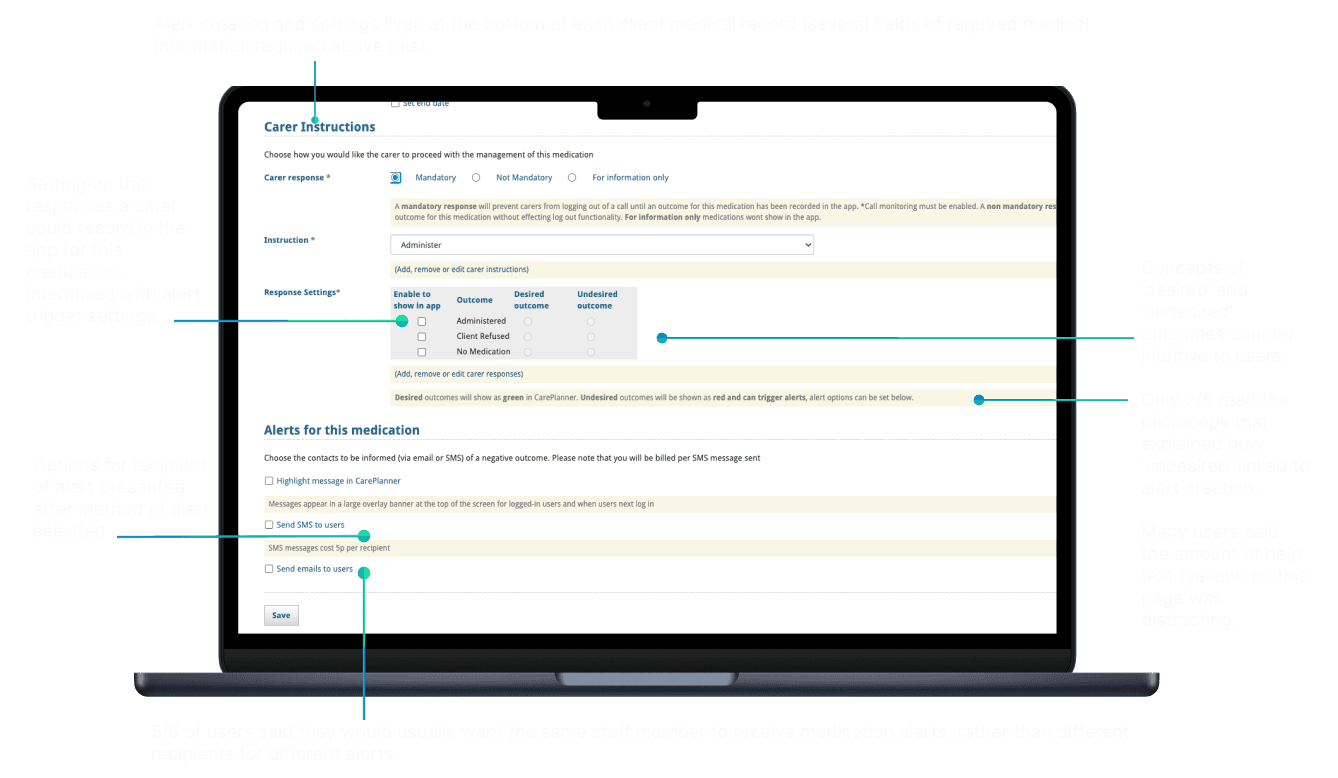
In line with the customer feedback steps 4 and 5 in the user journey, which required users to identify administration responses as ‘desired’ or ‘undesired’, were discussed at length. The use of language and placement of the alerts feature also gained a lot of attention, and it was suggested having the alerts feature at the bottom of a medication record, which was already a lengthy form, contributed to user fatigue.
With various ideas for solutions, I went away and wireframed the most promising options, which separated the alert creation capability onto another page. In this flow, the user could create an alert in medication settings, and then decide what actions would ‘trigger’ the alert on the original medication record page. Consequently, I was also able to remove the concepts of ‘desired’ and ‘undesired’ outcomes, which was a source of friction in the previous designs.
To review, I bought the stakeholders back and presented the wireframes. Stakeholders were enthusiastic – the updated designs would allow users to create one alert and reuse it several times, however, there were some concerns if the user would understand how to ‘apply’ an alert properly. To test the designs, I developed a prototype and conducted some usability testing.


Significantly improved user understanding.
Testing and Iteration


05 user errors
in total across all 12 testing sessions
From 7 p/session in original design
00:23 secs to success
From 03:03 mins in original design
'Much better for the way we work'.
Impact
+66% increase in task success
Old Design: 17%
New Flow: 83%
Measure of Success: 83%
-6.5 decrease in user errors
Old Design: 7 p/session (avg)
New Flow: 0.5 p.session (avg)
Measure of Success: 5 p/session


Next steps.
The final designs were planned and road-mapped for development.
Work to track feature adoption through user tracking data was prioritised and brought forward.
The customer-facing teams revamped the onboarding experience tailored for new beta testers, and collaboration with marketing and sales teams was enhanced to align the messaging of the medication feature.