Context
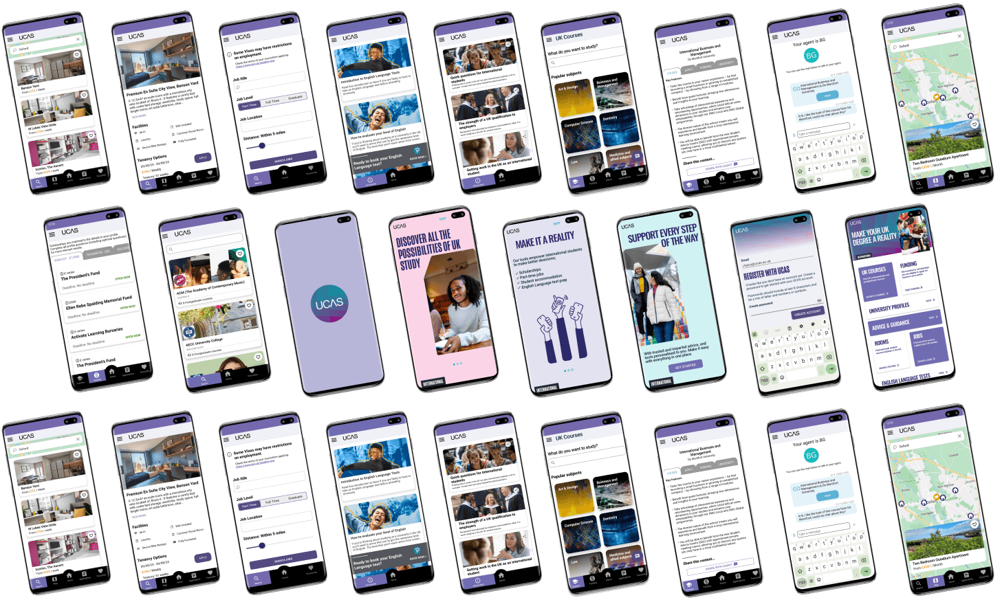
UCAS had just acquired a scholarship-matching mobile app and repurposed the experience into a discovery app aimed at attracting international students to UK higher education when I joined in 2021. The student-facing app was supported by two additional web products for UK universities and international recruitment agents, an internal CMS tool, and a marketing website. As the Product Designer, I was responsible for the experience design of 5 products in the international product suite.
Originally launched as ‘Myriad’ with a distinct yellow identity, strategic updates in core business objectives in 2023 looked to unify the international products into the wider UCAS brand.
Challenges
Despite healthy app download figures at launch, a noticeable decline in conversions from downloads to sign-ups emerged throughout 2022.
The challenge was compounded by the continual evolution of the student proposition for the app, leading to inconsistent messaging throughout core customer journeys.
The existing Myriad branding felt increasingly contrasting and out of touch with the UCAS master brand as we aligned more closely with core products and services. We needed a more complementary look and feel, but with some sense of recognizable identity to differentiate from other domestic-aimed products.
Results
Collaborating with an external agency to develop a new creative concept and update the value proposition of the international product suite, I led the design and implementation of the new branding across 5 products. For the student app, this involved working efficiently and quickly with the developers to implement the new designs and a new onboarding experience. As a result;
App and Play Store conversions increased by 482%.
Sign-ups after downloads grew by 326%.
309% improvement in active daily users.
Defining success.
Problems
A rebrand of all Myriad products and relaunch under the name ‘UCAS International’ name was decided to reinvigorate student interest. We worked with an external agency, Hybrid, to explore and define a new ‘international’ proposition.
Initially, focusing on the visual concept development, the aims of the rebranding work included;
Refresh the look and feel
International Gen Z users should feel attracted to and represented in the app.
Improve visual cohesion with UCAS master brand
Users should recognise the app as part of the existing UCAS digital estate and complementary to other student-facing products and services.
Encouraging curiousity.
Identity Development
Over several weeks, marketing, sales and I worked closely with Hybrid to develop a creative that established a recognisable ‘international’ identity, relevant to the main UCAS brand architecture.
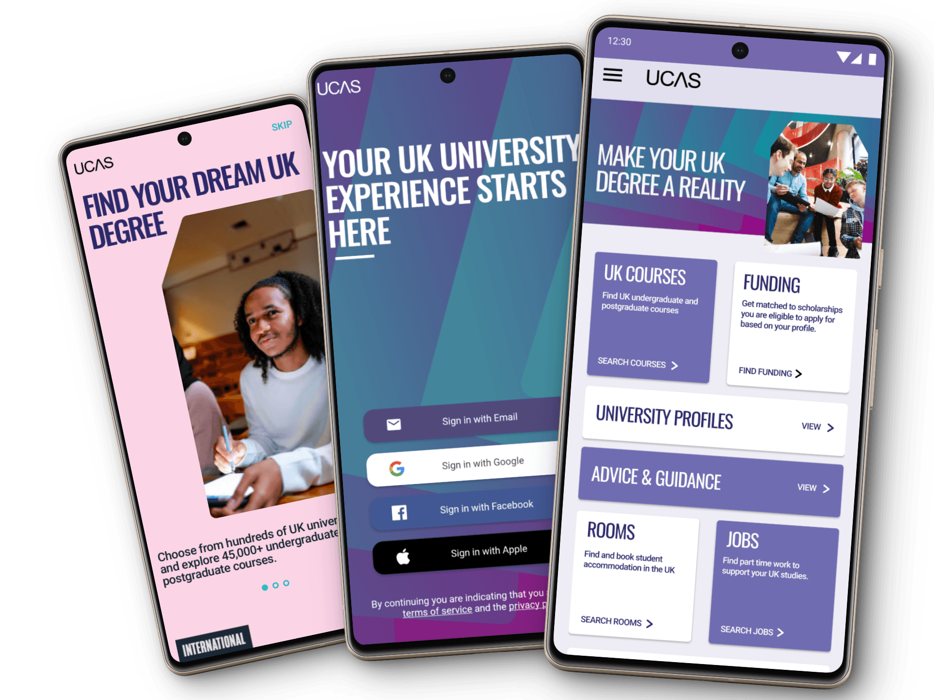
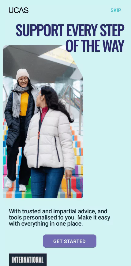
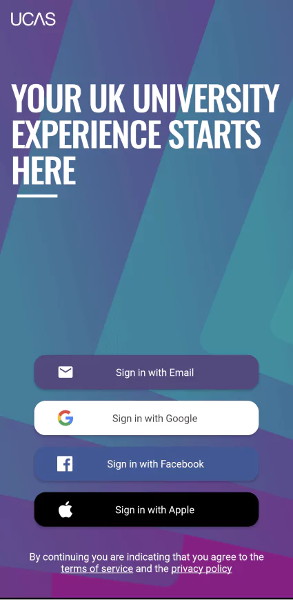
The favoured concept used distinctive pink, blue and purple colours from the UCAS master brand. You can see these colours demonstrated in the graphical brand background, a ‘layered’ or ‘stacked’ pattern, intended to symbolise a smooth progression through the steps of the international student journey.

Bringing the vision to life.
Design Application
With less than a month to update all the international products, I worked quickly in collaboration with developers to apply and integrate the new aesthetic.
The updated designs were well received internally, and sales and marketing teams were enthusiastic to show off the refreshed product suite.


Highlighting value.
Onboarding Designs
With a well-defined visual direction, our collaboration with Hybrid shifted towards the articulation of the value proposition and brand messaging. Starting with a targeted approach for learners, we focused on the following key themes:
Conciseness: Messages should be brief, clear, and instructional.
Aspirational Tone: Elevate messaging to resonate with learners’ dreams and aspirations.
Transparency: Emphasise UCAS’s commitment to transparency, reinforcing its position as a trusted brand.
To effectively convey these messages, I strategised with the marketing team to find opportunities to integrate and emphasise them within the product. One easy target immediately identified was onboarding screens.
Designing these screens, I focused on incorporating the messages that guided students from aspirational ‘Find your dream’ sentiments to a more detailed feature exploration, culminating in conversion-oriented calls to action.
Leveraging the luggage tag image containers on screens 1 and 3, I wanted to build a first impression that quickly and visually associated students with travel. On Screen 2, I introduced the new illustration style to add a bit of variety and intrigue.
The recommended bold, uppercase font served well to maximise the impact of the lead messages, I used Roboto for the supporting content as this was more accessible at smaller sizes.
Stakeholders loved the designs and felt the flow captured the intended tone of voice well.


“With learners, we want to start by exciting them about the possibilities a truly impartial and fairy platform can create – and the wealth of opportunity, choice and confidence they gain when signing up“
– Tone of voice guidance, Hybrid
Exponential Growth.
Impact
+326%
Increase in sign-ups after download.
From 7399 total signs ups between Oct-Dec 2023, to 31,561 between Jan-Mar 2024.
+309%
Growth in active daily users.
From an average of 76 active daily users between Oct-Dec 2023, to 311 between Jan-Mar 2024.
Increased visits to the Play and App stores and continued steady download figures signified that the updated branding and refined value proposition resonated with international audiences, which was promising.
Furthermore, the substantial increase in conversion rates in both the App and Play Stores, and over 300% surge in sign-ups post-rebrand, validated the impact of the revamped onboarding screens and associated messaging. Indicating these screens were successful in converting users and encouraging action.
Further testament to the project’s success was seen in the increase in user activity, and a consistent rise in daily active users has been observed since December’s release, most recently averaging 311 active users per day. This increase remained significant when accounting for the larger user base, so even without any product functionality or feature changes, the new aesthetic appeared to be better at engaging and sustaining user interest.
Next steps.
Work to improve user event tracking was prioritised to better understand user interaction and develop more personalised marketing nurture trails.
Design work to refine the student profile experience was also started - this was the last step in the app onboarding journey after registration, and at the time involved a lengthy form. Improvements here would complete the full end-to-end onboarding experience.